Free and easy organizations and associations
This is a “part 2” to the last lab note, LN 035: The Messy Desktop. In it, I touched on how we will fall to our system’s messiest possible state at times. When life or work is a bit chaotic, it’s often inevitable.
The itemized environment is home to all of your items — notes, tasks, emails, podcasts, projects, websites, articles, and so on. They can be gathered and used together, regardless of type or source. Breaking down the boundaries we experience today between our various apps (and the data they hold) is an intentional and core aspect to the itemized OS (the benefits of which are explored in these lab notes). But this also means we have a greater chance of making a bigger mess, unless the system finds no-effort and low-friction ways to keep organized. [1]
I don’t have complete answers here. But I have seen some pieces start to circle around the goal.
The directions I’ve explored so far: 1) Free and easy organizations, and 2) Interfaces that support orienteering and quick recovery of related items (certain interfaces adaptively surface related items according to how the user uses their graph).
Though our systems should be capable of meticulous, well-modeled organizations — the graph of items certainly is (LN 014) — most of the time, they should do much of the work for us.
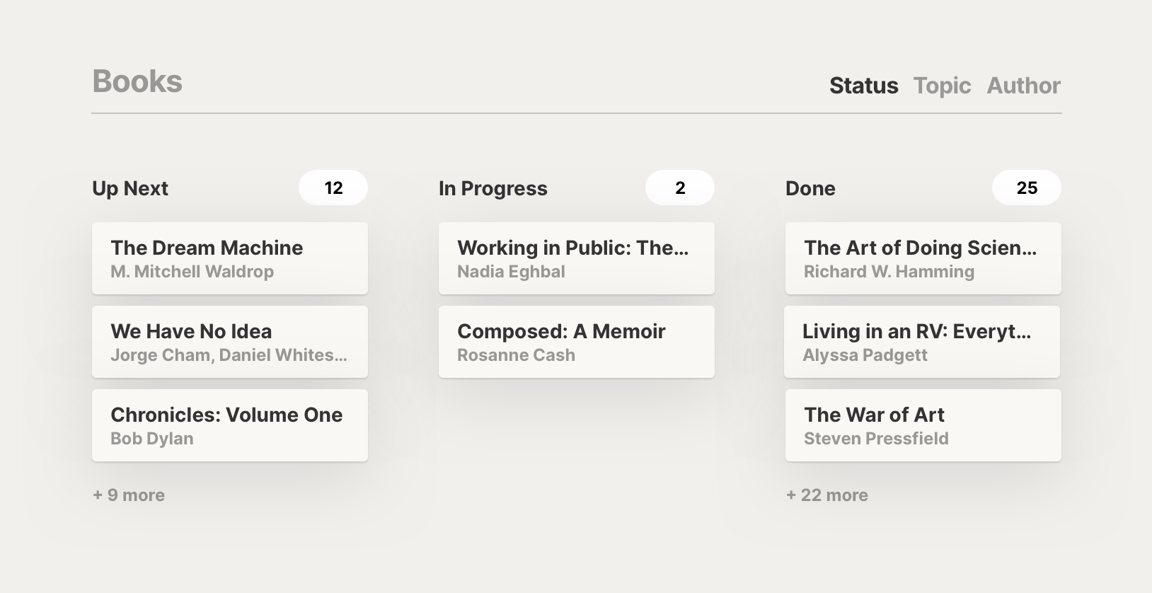
Organizations that are implicit or byproducts of our natural behavior are one ideal; these we get “for free”. Close to that are those which are easy: clear, quick, and straightforward. In Spotify, for example, your year’s top songs playlist is a free organization based on your natural behaviors using the app. And the heart button is an easy organization: it’s one click to add any song to your library, and the button is always present alongside your primary controls to play, pause, or skip.
We’ll explore some glimpses at these ideals seen in the itemized OS, before closing with a few other considerations and provocations.
Fluid workspaces, explored in LN 031 and LN 033, let us use any arbitrary item as a non-volatile workspace.
Say you’re looking at your day’s task list, and you choose a task you’ll work on next. You could open the task, which makes it your fullscreen workspace with any items you saved in it loaded and ready (as seen in screenshots of LN 033). As you open other items in the course of working on the task, they are naturally stored as references within the task item. Should you return to this task later, rather than needing to find the workspace you were in or the items you needed, you’d simply return to the task and open it again, where you’d have all the items you’d used so far, right where you left them.
As you use these fluid workspaces, you get lots of connections as a result: the containing item has a direct reference to all the contained items, and all the contained items now have second-degree connections to one another.
In digital spaces, people engage in “orienteering” when looking for desired items: generally, they will search for a known, related thing or use an imprecise query to get close, then browse from there to their desired result.
We can support this behavior by adaptively surfacing associated items so people can get to the things they’re looking for however they’re remembering them in the moment: by a date they worked on it, a project it was in, a related item like a person who they emailed about it, etc.
All of the connections that form among items are used to surface associated items whenever you’re in a workspace. In LN 005, these were discussed as formal, weak connections saved on each item, but in my more recent experiments with the itemized OS, only direct references are saved, and this “adder” view surfaces second-degree connections as it traverses the graph. The adder can surface items related to those in a current workspace, prioritizing those which come up with first- or second-degree connections to multiple open items.

Similarly, we explored a “cross-references view” in LN 015: once your items have all these connections to one another, they can be automatically organized by the “parent” references they have in common with one another. In EXP 001, I found that this generates lots of views that I find meaningful among my graph of notes, which I would often otherwise manually build from scratch.
A similar example can be seen in automatically-compiled daily summaries (LN 017), which I’ve been expanding on in a new experiment since late last year.
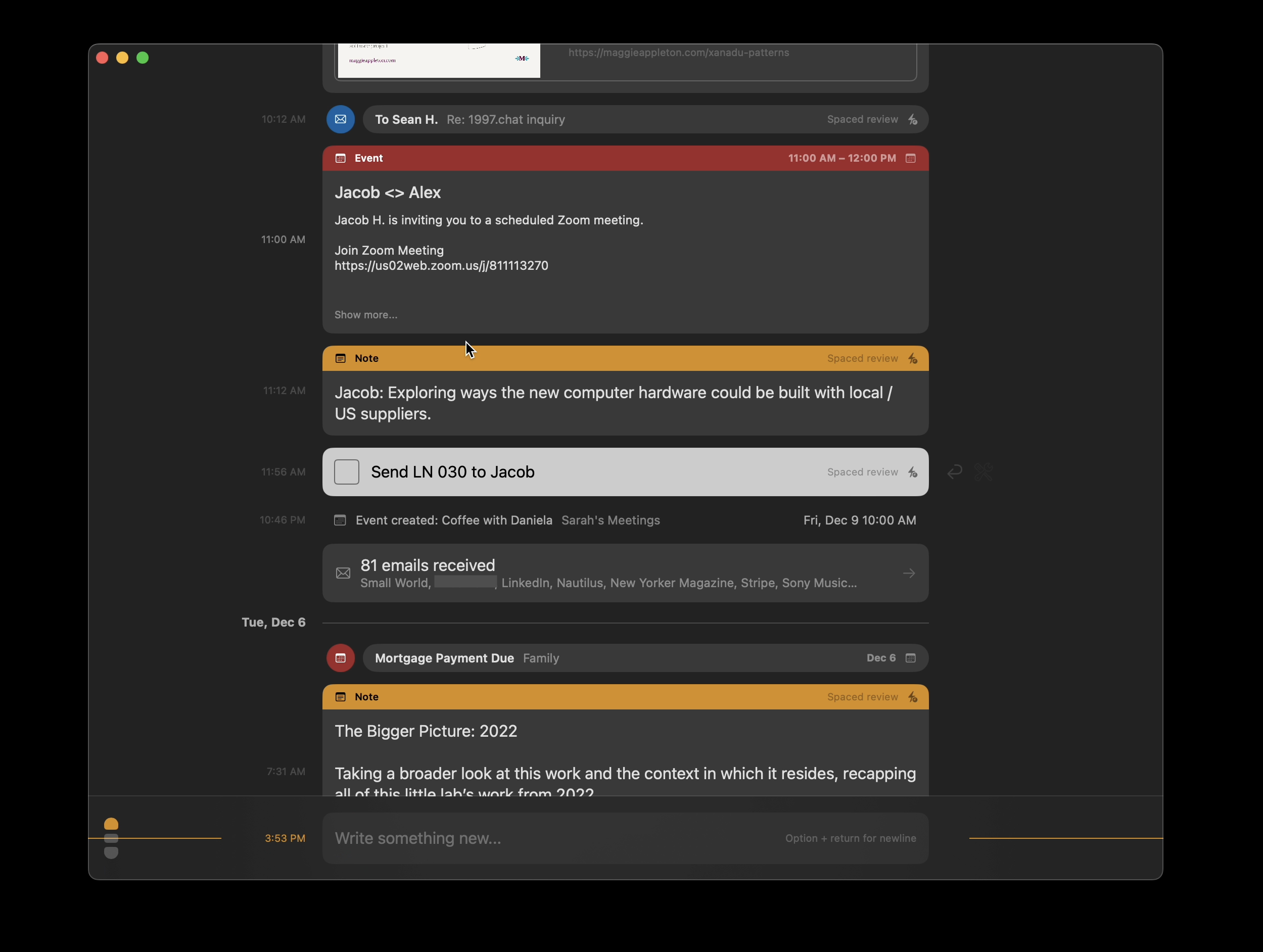
The new experiment, OLLOS, organizes your items on the dimension of time. You get this organization “for free” since it’s simply a log of when you’ve engaged with different items, which naturally gives meaningful context to the things in your system. A note you recorded during a meeting appears sequentially with that meeting in the timeline; an email you sent after working on some to-do appears alongside the completed item.
Even without references to one another, items are situated within the context of what happened around the same time. Since the dimension of time is self-organizing, using it as the organizing principle for an itemized environment gives us certain mental ergonomics we often lack in other digital environments. And our tendency towards orienteering can rely on the anchors in our memory of the past and how things relate to each other in time.
Besides what we get “for free” from OLLOS, the experiment also tinkers with “easy” organizations.
You can reply to any item with any other item you’re creating. You can even reply to multiple items at once. This reply button, next to every item, lets you quickly associate items with one another, regardless of where they appear in the timeline. I often reply to a past note with a new one that develops the thinking further, or to a note with the to-dos it generated, or to an event with a note summarizing the discussion. Rather than composing a hierarchy of various items meticulously organized, I have a single button to grow threads of things evolving over time — something I’ll explore more in future experiments.
OLLOS also uses spaced repetition to help me review active items, such as incomplete to-dos, un-reviewed notes, or saved emails without replies. This is in its early stages, but the goal here is to create low-friction ways to keep on top of the things I want to read, do, or think further on, without the high-friction dynamics of a never-ending inbox.
Earlier this year, I started publishing an ongoing project WonderOS, and with it, a guide to the itemized environment, Hello, Operator!.
The guide touches on this idea of being capable of meticulous organization, while also doing lots of the work for you:
Keeping organized
Much of the context and connections among your items happens as a byproduct of your natural actions: adding tasks to a list creates a relationship between the list and its tasks, just as assigning a date to one of the tasks creates a relationship between the date and the task; opening a task as your workspace creates a relationship between the task and the items you go on to use as you work on it, and it creates shared context among those items; simply taking an action on any item gives it some context at that time and on that date, shared with anything else happening then, such as a meeting with a colleague.
Some people prefer to meticulously organize their things, while others like to simply use their itemized system however feels natural and make use of orienteering to find things later, as we saw in an earlier chapter. The itemized OS is great for both: with its capabilities for rich expression of items and relationships, you can reflect your thinking in high fidelity, or you can quickly search and browse your way to needed items via the connections made from paths you’ve taken before.
This is aspirational for WonderOS, as is much of the guide. It’s an ideal that deserves further exploration and experimentation.
I should note that the opportunity to make a mess is good. How do your tools and environments limit or support you? If you can’t make “bad” music with your tools, then you can’t make new music either (LN 028). Suitably expressive environments that let users create new software or functionality will be inherently open to complexity and messiness.
And one might wonder, what is the verdigris in our digital realm? Willie’s guitar Trigger is road worn but well-maintained [2]. A woodworker’s workbench picks up oil stains and nicks from the projects it has supported; at the end of each project, everything returns to its proper place, but some traces of projects past are left behind. These become enduring cues and nudges among our tools and environments, and are just as important as the cues we intentionally place around us (the book on a new topic, the plant from a friend, the instrument you want to learn).
Notes
[1] The app boundaries on our devices today aren't right, but they do give us some amount of containment. Even though these boundaries don't match our mental model and introduce lots of limitations and little frustrations, it does have this benefit. If the contents of your notes app grows too unruly, you can start using another with a clean slate — a bandaid fix that just works, since apps have become data silos. [Return]
[2] More about Willie Nelson's guitar Trigger is on Wikipedia. A lovely mini-doc on maintaining the instrument can be found on YouTube (featuring, as a commenter says, the "Bob Ross of guitar maintenance"). A shorter video gets you up to speed on the guitar's story in around 3 minutes. [Return]
Something spark a thought? Email me, or come chat on Bluesky, on Mastodon, or on Twitter.
