Cross-references & References cloud
In LN 012, we explored how references might be used to organize all of our digital things. And in LN 014, we explored how these items’ references to one another, taken together, form one large digital items graph that contains everything within our personal computing domain.
Given the difficulty discussed in LN 013 of representing our things in a strict files-and-folders hierarchy, the graph gives us newfound freedom to represent our digital things in the various ways we think about them.
Our system can make use of the rich data it has on how all of our things connect to one another. Here are some initial thoughts.
Let’s say we’ve added items into our graph with references from:
- An item for type, e.g.: Book, Website, Article, etc.
- An item for status: Up Next, In Progress, Done
- An item for topic, e.g.: Personal Computing, Guitar Making, etc.
- An item for activity, e.g.: Reading, Writing, etc.
- An item for person or author
- …and so on.
This means within our Book item, we have references to many items that are also referenced within items representing their different statuses and topics. Similarly, our Up Next item would have references to many items with various types and topics.
Our system knows this, and can surface the most common cross-references automatically. It can do this without us setting up these complex relationships; we only set up each individual item’s references through the course of our work, as seen in LN 012: References box & Topics. Our system can adapt more useful views according to the references we use.
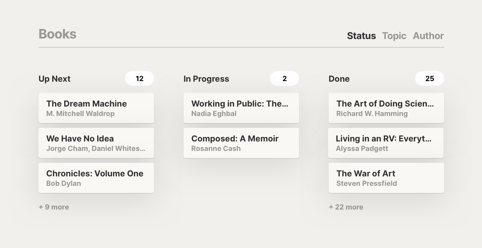
For example, rather than seeing one long list of everything within our graph that represents a book, we might have a layout within our Book item that allows us to view common cross-references as columns. We might have a set of columns for the status of each book, and another set of columns for our frequently explored topics.

The columns for status could even allow us to drag and drop items, automatically adjusting the references on dragged items to reflect their new status.
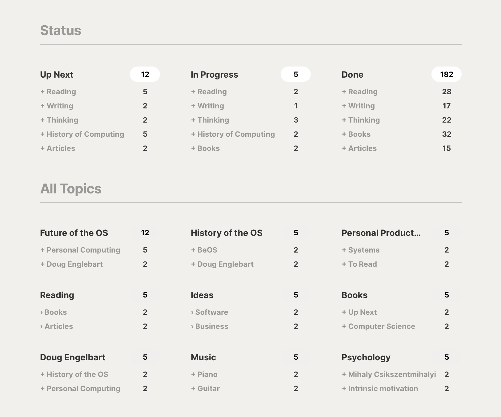
Another view could surface cross-references one level deeper. So, rather than seeing specific items listed under a status, we might see the topics most commonly found among the items in that status, allowing us to directly click into more specific views from one higher-level overview.
The system can figure out a lot on its own, based on how frequently I use some references. But by being able to mark some items as favorites among the references, I can ensure the interface I’d like is presented. In this example, I’ve marked statuses as favorites, so that they are shown at the top. I’ve also marked Reading, Writing, and Thinking as favorite cross-references.

This forms a “references cloud” in our system, showing the most common topics and their most common cross-references. We can browse into specific subsets of our data according to our needs at any moment.
For example, looking at this screen, I can see that in Up Next, I have some things I plan to read next, some writing projects queued up, and so forth. If I’m digging into my work for the day, I can jump into what writing I have in progress. Or if I’m looking for something new to read, I can click to directly jump into what books I have listed as up next. Or further down, I can click to directly jump into only the books specific to computer science.
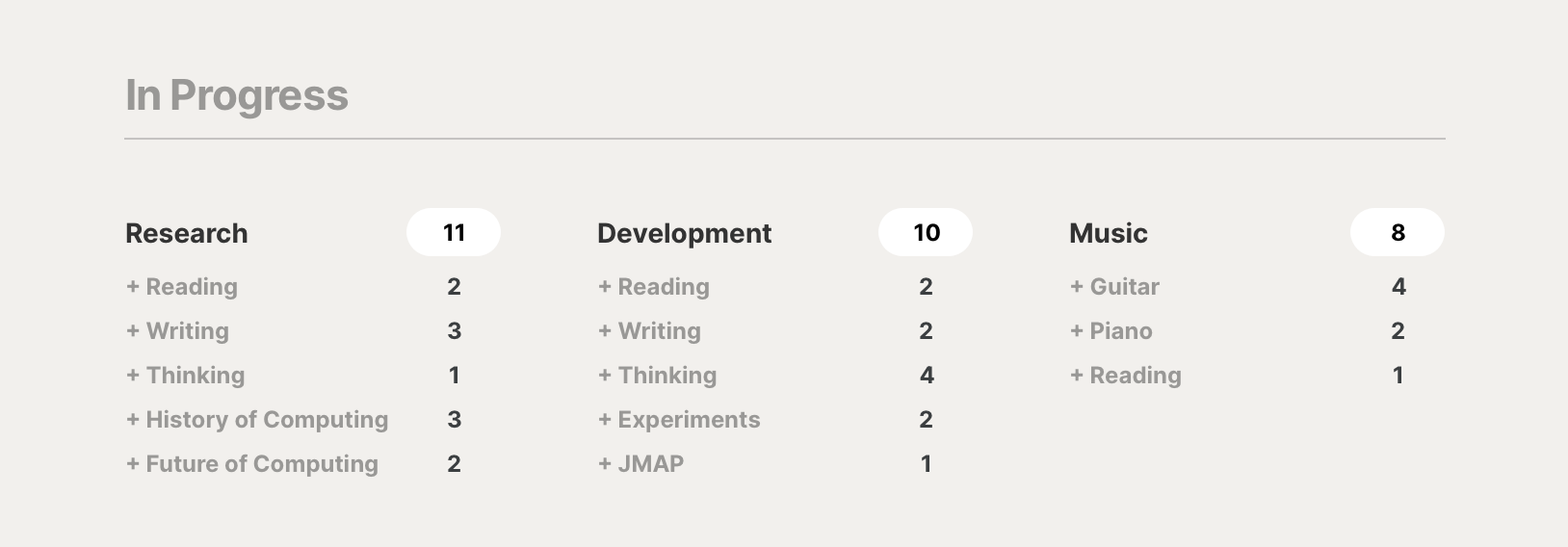
If I go to In Progress, the references cloud becomes a workspace for what I’m currently working on.

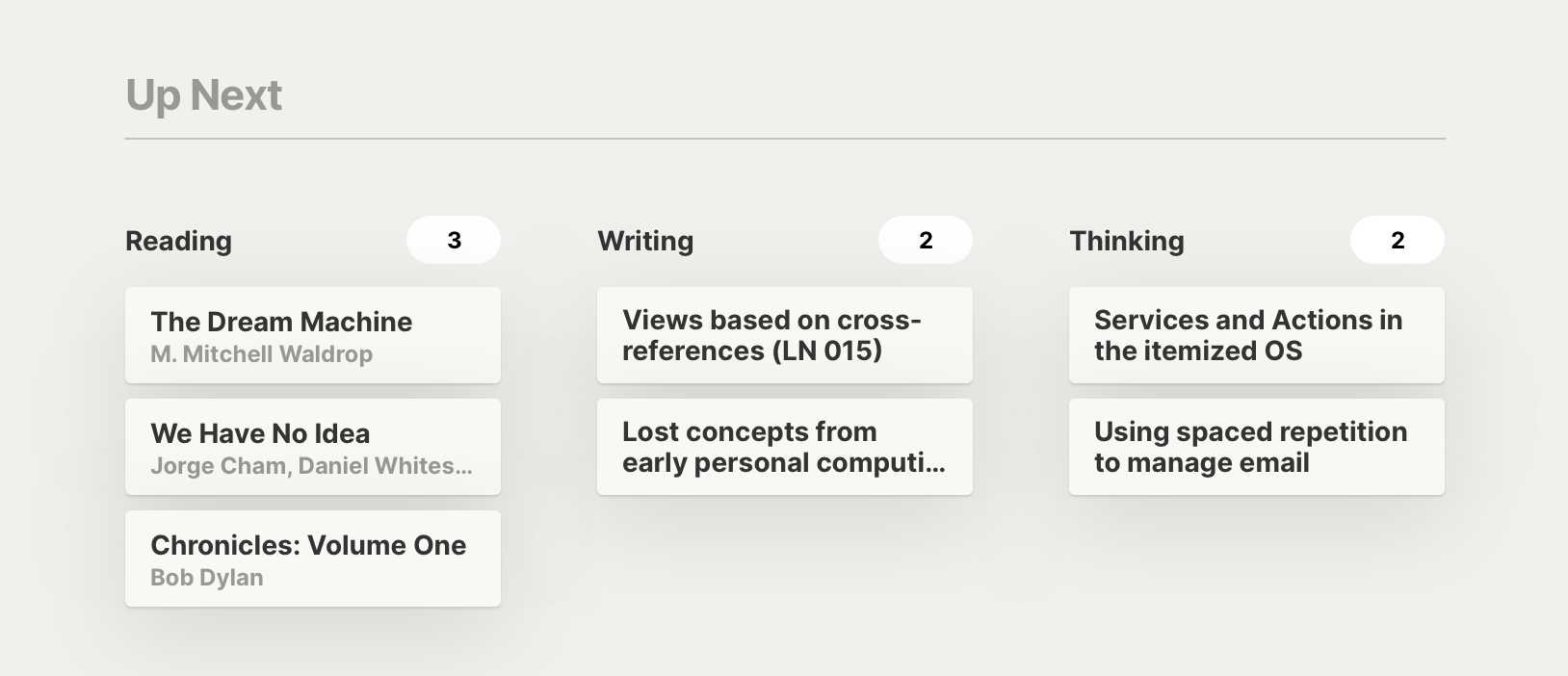
Of if I go to Up Next, the items view becomes a space filled with the things I’d like to explore next.

My system adapts a number of interfaces tailored to my workflow by reacting to the references I define among my items.
I’m working on a small plugin for Obsidian that lets anyone use this concept. Naturally, it’s only for notes (rather than for all items in one’s personal computing domain), but it’s an interesting starting point to see how this lab note’s thinking unfolds in expanded practice.
If you’re interested in trying it out, stay tuned – I’ll let you know when I’ve published it.
Something spark a thought? Email me, or come chat on Bluesky, on Mastodon, or on Twitter.