System injections
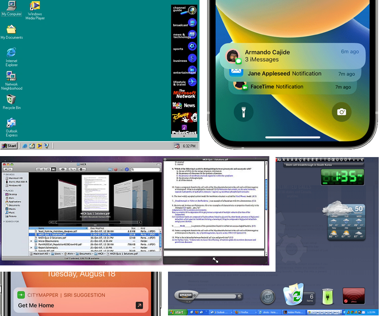
Over the years, operating systems have offered various ways system and third-party software can inject users’ things and activities into system interfaces:
Menu bar, dock, taskbar, system tray, widgets, notifications, app clips, search, file icons, Quick Look, and so forth. [1]

These “system injections” are a nice mixture of consistency and uniqueness. The system defines and implements some consistent experience, and creates room for the injecting software to explore how it might uniquely offer something new that the user cares about.
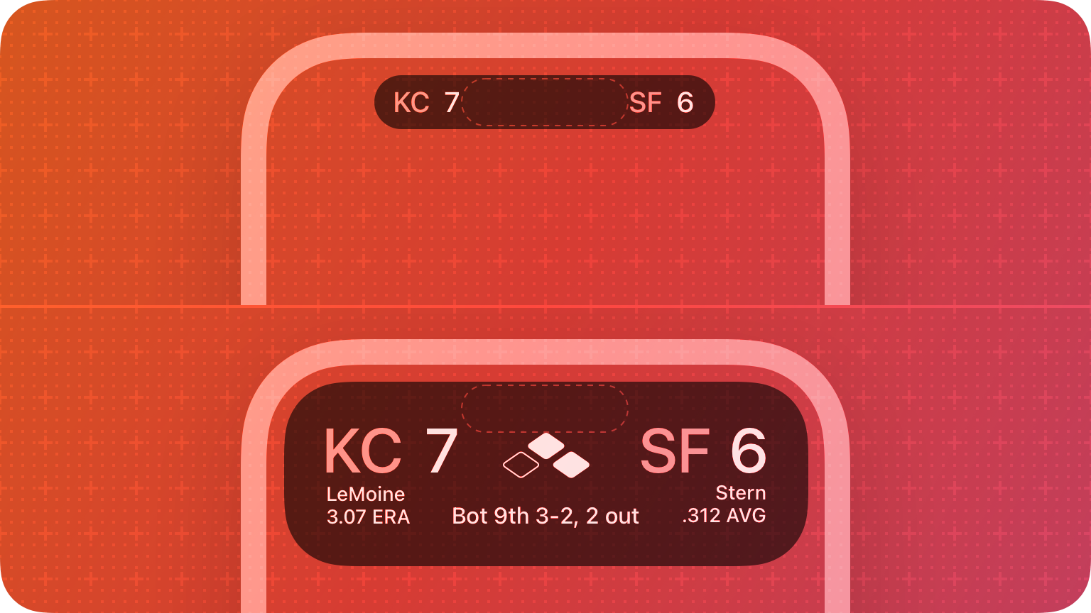
A delightful new system injection was included on the latest iPhone, the “Dynamic Island”. It allows users’ ongoing activities — from both system and third-party software — to appear at the top of the screen (among other features that expand from it [2]). These can be tapped to open the corresponding app, or long pressed to open a simpler widget over top of the current screen’s contents.
Previously, ongoing activities from background apps were rarely apparent or accessible; the OS began on phone screens just 320 pixels wide and 480 pixels tall, so there hadn’t been room for something akin to an ever-present taskbar or system tray. At best, you could see, and jump to, an ongoing phone call or screen recording via the colored bubble that encircled the current time. Anecdotally: Many in my family-and-friends circle never knew what this was, or how to use it. It was a fiercely limited form of placing a current activity on the screen at all times, on a screen that was fiercely limited in space.
But the screens have grown over the years, and now even the space dedicated to front-facing hardware is shrinking. Apple has taken advantage of the newfound space around this “pill” cutout with a fascinating concept that allows for current activities to be present on your mobile device’s screen at all times. Now, when you’re listening to music, you can see what it is, or jump to it, no matter what app you have open. Same with a call, a timer, a screen recording, etc.

You can even have two activities shown at once; the primary example seen in promos and reviews is of an ongoing timer, in a smaller circle, beside another activity, such as playing music or a call. Having up to two activities always displayed and accessible? This is a feat to be accomplished on a mobile screen without creating frustration, but instead, delight!
Some of that delight is because the Dynamic Island offers a richer system injection; often, injections of this type are mostly text, occasionally with an icon. Limiting them this way means the system has more control; there’s less that can go beyond the intended bounds of functionality or use. But the Dynamic Island allows injecting software to place interface components fairly freely.

Injections are one of the most important ways we can make modern systems and devices truly “ours”. They’re often the thing that makes software feel personal, more closely suiting our needs, beyond what the original manufacturer could have come up with and built themselves. They can help open closed systems (a bit), and make open systems easier to adapt.
Their balance of consistency and uniqueness can get close to “perfect”: they always look and work the same in ways that matter (i.e. size), while being open to bespoke implementations for new ideas. This gives users an experience they can rely on (such as pressing the space bar to open Quick Look on a highlighted file on macOS), while extending it with specifics a user needs (such as installing an app that renders a user’s unique file type in Quick Look panes); bringing this expanded functionality across the entire system (such as being able to view this unique file type from any app that uses Quick Look, such as an email client previewing a received attachment).
The system gets to define and enforce what it decides is important to remain consistent, and the injecting software gets to be bespoke in the ways important to its content or use; it can be unique in ways the system may not have even anticipated, allowing third-party developers to experiment widely while remaining tethered to the consistency that the user expects and relies on.
Really, apps are another (expanded) form of this. You can always trust that switching between different apps will work the same, regardless of what apps you install. Yet you can install any app you want (on participating OSs), which can render an entirely bespoke UI on your screen, and make use of other input and output hardware as it sees fit.
This is one of the most important forms of freedom in personal computing: the ability to develop into the spaces a system makes available, and the ability to install things that have been so developed by others.
Injections are effectively the fundamentals that the system comes up with, or they express the fundamentals with which the system expects users to think and communicate. System and third-party software use these fundamentals to make their ideas available to users. Users can learn and rely on these fundamentals, across all software they install now and into the future. Apps, notifications, widgets, menu bar items… these are the fundamentals of today’s systems, which you can trust to work the same in ways that matter, while being open for injection of new functionality with new software. Deep links and integrations with Siri on iOS expose fundamentals of actions and queries. Many of the injections on macOS are shaped around the fundamentals of apps and files.
The itemized OS is entirely made up of system injections: components provide various sizes of views, which the system uses to render items, big and small, throughout its interfaces. It even uses these to render items that are placed within other items. In an original lab note, I mentioned that this made the itemized OS “inverted” in some sense: rather than providing interface components for apps to use, in the itemized OS, installed view components are provided to the system, which makes them available within larger item or system views.
New system injections have always sparked some excitement over the decades; a new one is an opportunity to think about new ideas for how new software might let us do new things on our existing devices… or what ways new fundamentals could be creatively misused to make surprising things happen, to expand what our devices are capable of. There have already been some “creative misuse” remixes with the Dynamic Island: a Pong-like game, or Apollo’s pixel pals.
Notes
[1] Thanks to a number of folks for bringing up more interesting system injections in this thread.
And who could forget all the browser toolbars that slowly took over all our vertical space back in the day? [Return]
[2] Something neat about the Dynamic Island is that the "pill" cutout housing the front-facing hardware is used to anchor this system injection, almost communicating that this is where you interact with your device more deeply — often with both its hardware and software. For example, another use of the Dynamic Island is expanding it into the FaceID indicator. This is slick: the Dynamic Island is precisely where the instruments that you need to look at are. On the iPad Pro, there is a system UI that presents an arrow pointing towards this hardware when you're covering it up, a common occurrence when you're in landscape mode. The Dynamic Island implementation is a much better interaction. [Return]
Something spark a thought? Email me, or come chat on Bluesky, on Mastodon, or on Twitter.