Foldable views
As I was laying out all the ideal views within my operating system of the future, an interesting pattern kept popping up: foldable views.
In the itemized OS, everything is an item made up of other items, and you can have many different kinds of views on the same items. This lets you see things at varying levels of detail, or use different methodologies as circumstances change.
Dates are themselves items, which contain references to other items, such as tasks and events.
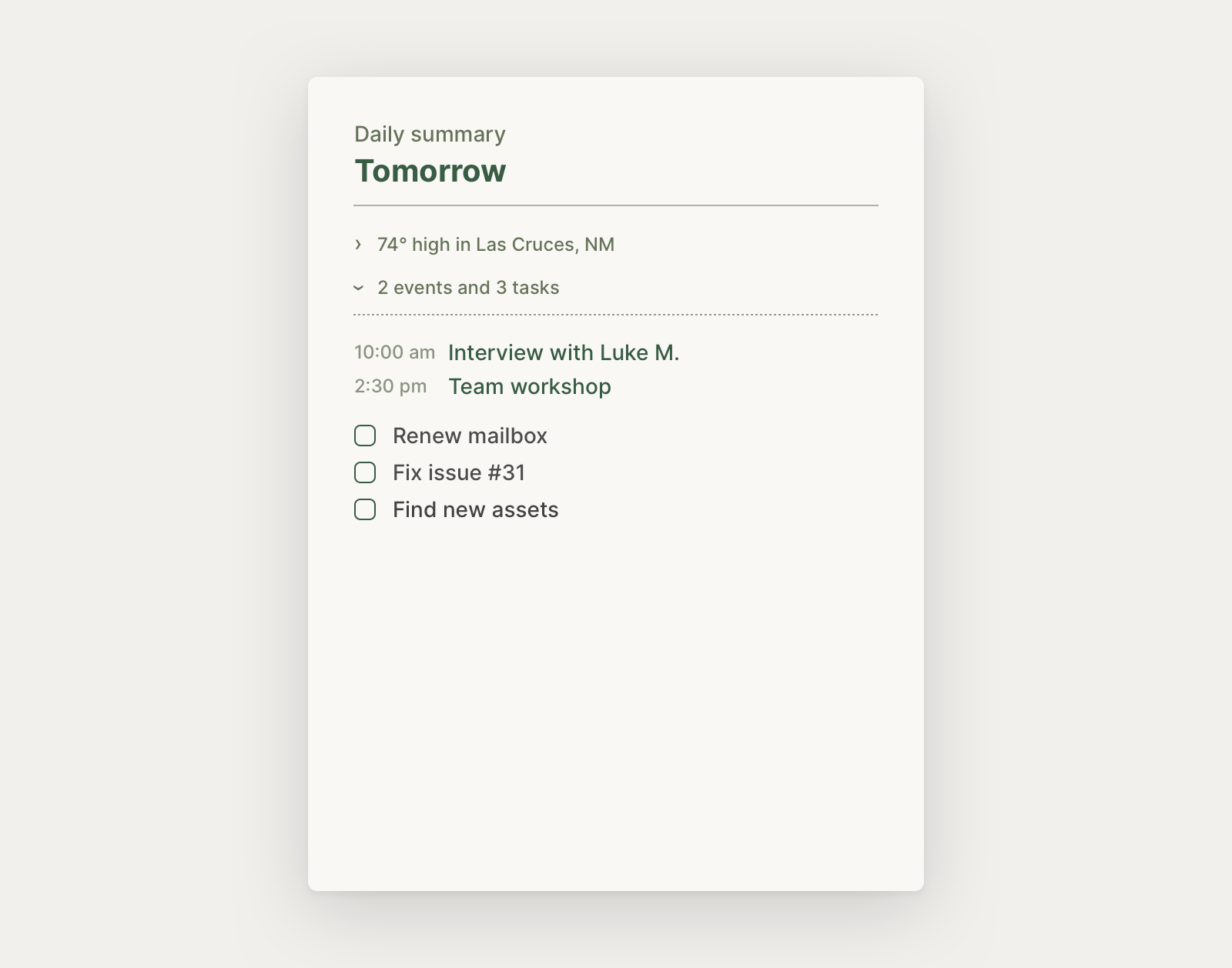
I often schedule tasks for specific dates in the future, and they come up in lists by date once I need to do them. I usually like to view my tasks by day, such as in the daily summary, which we’ve explored before:
But a few times a year, things are slower (during the holidays, around vacations, when sick, etc.). These weeks, I prefer to simply see all of the tasks for the week as a whole; there are far fewer tasks, and I have less time on my devices — I want to see more, quickly.
How I handle tasks, even how I think about tasks, changes — but temporarily.
In more rigid software, I’d have to work around the features that are designed to work well for most of my weeks, or temporarily adopt a simpler piece of software for the week.
Instead, the itemized OS should be more fluid — allowing me to use the same items with whatever view I need at the moment. When viewing my week, I can “unfold” the view to see greater detail for each item, or “fold” it for a more concise overview.
You can look at just one column for this week, or you can unfold it into separate cards or columns per day. Either way, you’re in a browsing path, where you can also pull up other items as needed.
It’s a basic example, to get us started, but it starts to show what’s important here: allowing for greater fluidity by taking advantage of the fact that items and their views are decoupled in an itemized OS.
I’ve found that this week overview is useful not just on lighter weeks; it also serves as a wonderful way to get an overview of and plan the upcoming week or review a week that has passed. When reviewing the upcoming week, I can fill in all the other things I need to do with the previously scheduled tasks.
This view is also quite handy with my projects: sometimes, I like to see a quick overview of my projects; sometimes, I want a more detailed overview breaking down of each of my projects; and other times, I just want to dive into one.
Let’s take a look at the foldable view for my projects, on a mobile device this time.
Here you can see that the initial pane has my folded overview, which I can scroll down, and tap any one project to open.
But when I want a more thorough overview of where all my projects stand, something I like to do when starting a new week or phase of my work, I can instead swipe on the header of the pane. This slides me through each project, one-by-one.
In this way, on mobile, I don’t even need to “unfold” the view, but rather interact with it directionally:
This also lets me create projects at either level: if I’m adding a handful at once, I can simply add them to the overall list (rather than fumbling through many views); or if I’m just creating one new project, I can do so at the lower level to add all the details I’m thinking about in one place.
I use a foldable view as my “daily workpad” in which I can unfold the items queried into that view: today’s tasks, a daily note, and an “item feed” of all the items I’ve modified or created today.
In this example, you can also see that I’m able to expand and collapse items inline, or unfold just one or a few items if I wish. Though I might expand all at some times of the day, I might also only pull out one of these while I’m focusing on some task at hand.
This also comes in handy during my morning routine, when I want to get an overview of the day ahead: weather, events, tasks. On mobile, I can simply swipe through each pane to get a deep dive on the day ahead.
You can imagine each of these items in my day’s pane being rendered by more visually rich widgets, which would help turn this view into a wonderful home base for my days.
Knowing this pattern in my OS of the future, I also started to see glimpses of it elsewhere; you can envision it applying in many cases: a read later list, an overview of a project item’s contents, and so forth. In an email inbox, for example, you might have an overview of a few categories of received emails: conversations, social, updates, and newsletters — you could view a quick overview of your entire inbox, drill into one category specifically, or swipe through for an overview of each.
Ultimately, this thinking highlights something important about the itemized OS: that items can be organized and used more fluidly. In an OS of items that can freely reference one another, and in which items are independent from the views that render them, you can have adaptable views and hierarchies that give you multiple, different perspectives into the items that you work with every day.
This is another form of thinking native to the digital realm.
Something spark a thought? Email me, or come chat on Bluesky, on Mastodon, or on Twitter.