Live items & Contextual notifications
In this lab note, I will discuss two things: live items and contextual notifications, then I’ll bring these together into a new way to think about notifications in the OS of the future.
Live items
As we’ve explored it so far, your digital workspace is made up of the items you’re actively working with. But often, you want to keep things you’d like to stay updated on in your periphery.
In LN 032, we explored how system injections in OSs past and present allow a user’s preferred software to augment system interfaces.
We have also previously explored how in an OS where everything is an item (a note, a todo list, a todo in that list, and so forth), we can rely on services (LN 018) to bring new items, or updates to items, into our systems.
Now, we want a system component that lets us keep items which are being updated by services — the ones that we want to stay updated on, at least — within our periphery. This could take many different forms: a drawer, panel, overlay, and so on; but we will stick for now with a form that is fairly recognizable.
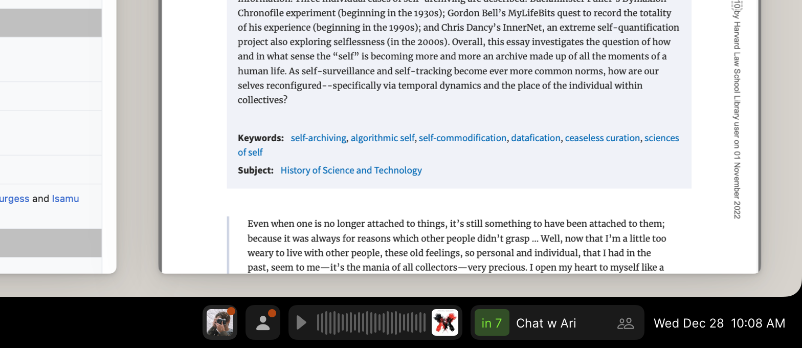
Consider: If we had a system bar below our active workspace, we might be able to pin live items into it that we’d like to keep tabs on. We might pin some items manually, or expect some to appear automatically. We might have the weather for our current location, an event that’s coming up in a few minutes, the score of a game we’re interested in, the ETA of a friend’s flight, or audio that we’re currently playing either on this device or elsewhere on our personal computing network.

What makes an item “live” might be a service that is updating it from an online source, a service that is updating it from a hardware device on our personal computing network, or simply an update to the item view’s rendered countdown relative to the current time.
Contextual notifications
With our graph of items, where everything is an item with references to other items, we can do some wonderfully useful things that are trivial to arrange, yet often impossible in today’s mainstream operating systems. One of these is contextual notifications.
For example, instead of having all email notifications enabled or disabled, you can enable a smart subset: emails from a few important people, and those which relate to something you’re working on now or will be handling soon.
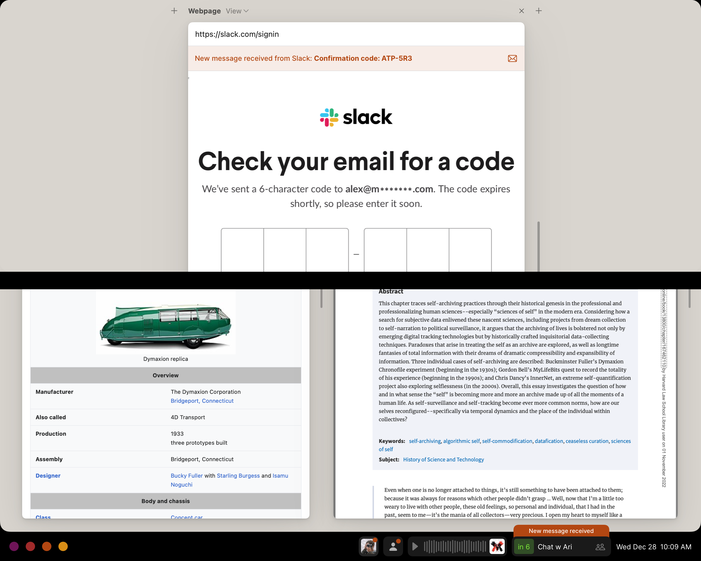
Consider: We could set up a notification to post whenever we receive an email from someone we’ll be in a meeting with soon. Similarly, we could set up a notification to post whenever we receive an email from a website we’re currently on. And instead of floating over our screen in one corner as they might in today’s mainstream OSs, these notifications could appear on or beside the item they’re related to:
This covers a lot of useful cases: when you need to click a sign-in link to continue on a present webpage, when you’re attempting to download something from a webpage that you have to open an email to access, when you receive an email from someone who will be running late to your upcoming meeting, when you receive an attachment you’ll need during an impending meeting, and so on.
Since an “open” item is simply a reference in a workspace, it’s trivial to set up a notification for your itemized system that sees if an incoming message is related to something you currently have open.
A new way to think about notifications
After some time of thinking about notifications that only pop up when their updates are related to an item that’s currently on screen, I started to wonder: what if this was the only way notifications worked? What if all “notifications” were only presented if they were updates that relate to an item that is currently on screen, and were presented on or by that item?
You’d receive contextual notifications for any items that you have open in your primary workspace, such as a present webpage. And now we have this concept of live items that are pinned in a system bar (or other interface component), which would always show their current status, and would present notifications of updates as well.
Besides live items, we could also pin anything into this system bar: a user could put their significant other’s contact item into the bar so that they’d always receive attached notifications about emails or other messages from them. (Plus, they could click the item to quickly start a new message, or drag and drop something on the item to send it their way.)
Now we’re defining our focus with what’s on screen: we’ll put into our visual periphery that which is allowed to interrupt us; that which we’re interested in following along with while we progress on the present work in our active workspace — and as we open items in our active workspace, those too become candidates for notifications. Anything that isn’t reflected on screen is out of focus, and won’t interrupt us.
The screen becomes the visual definition of our focus; there is no opaque set of settings and definitions tucked away in system views for what kinds of notifications might be permitted. Below our active workspace, the system bar becomes another place to have items present, but summarized, and available to receive in-context notifications. If you are waiting for an important update on something, you can simply drop the item into your system bar. You can define what’s in focus by only having items for the things you want notifications from within your visible panes; hiding something or removing something from these would be equivalent to muting them.
In the app-based world, when you want to receive notifications about a food delivery on its way, you’ll also often receive ads and deals in notifications from that app in the future. In the itemized system, where only on-screen items can have notifications, your delivery tracker would be a live item letting you know the progress of your order and its ETA. Once it has arrived, the live item would no longer be on screen, and if you have no other related items open, you’ll no longer receive notifications. What is on screen becomes fine-grained, clear, and modifiable control over your notifications.
Essentially, this proposes showing updates to items prominently on the items themselves, and using both this behavior and a system bar for peripheral and live items to replace our current notion of notifications.
You could take this thinking further: Should you want to check on updates from other things somewhat regularly, but not be interrupted by them, you could put them into an off-screen drawer or panel that you can check when you want to. They won’t interrupt your current activity, but you can open the panel to see these items’ updates. For example, your inbox might be in the secondary drawer.
Similarly, the main periphery component could be anything; it doesn’t have to be a system bar. It is a persistent, peripheral view which could take many forms. It could be a sidebar, for example, with items arranged as tiles; alternatively, it could be presented on a secondary device or screen, or on mobile, it might be one’s preferred home screen (which becomes reminiscent of Windows Phone’s Live Tiles).
I’m not yet convinced that this is an ultimate answer; but it is an interesting perspective on a feature we take for granted. It lets you define the surface area of your focus with what’s visually on your screen — a compelling prospect. You can easily define what interrupts you, and with a secondary drawer, what you want to check manually. This rids much of our focus from being defined in many hidden system settings.
And, when you want to see a log of all updates to your items, you’d head to your timeline views — something I’ll have an experiment to share with you in a lab note soon. Stay tuned.
Something spark a thought? Email me, or come chat on Bluesky, on Mastodon, or on Twitter.
