Extemporaneous UIs
No task is as rigid as today’s software interfaces. Our needs ebb and flow, different things grow and decay in importance, our focus moves over time to different parts or aspects of the work we’re doing. What’s in your focus, your periphery, and in the background shifts as you move through your work.
Besides bringing one program’s window(s) to the foreground, we largely lack meaningful ways to represent this fluid ebb and flow with our digital tools and materials.
But extemporaneous UIs are different — they follow your interaction to emphasize needed things over others, to provide greater visualization and control over focal aspects or items, or allow you to rearrange the tools and materials within your workspace.
Let’s look at four or five examples.
Tear-off menus
Tear-off menus have shown up in numerous systems throughout the decades, allowing users to pull the controls they need most often persistently into their workspaces.
From the HyperCard manual:
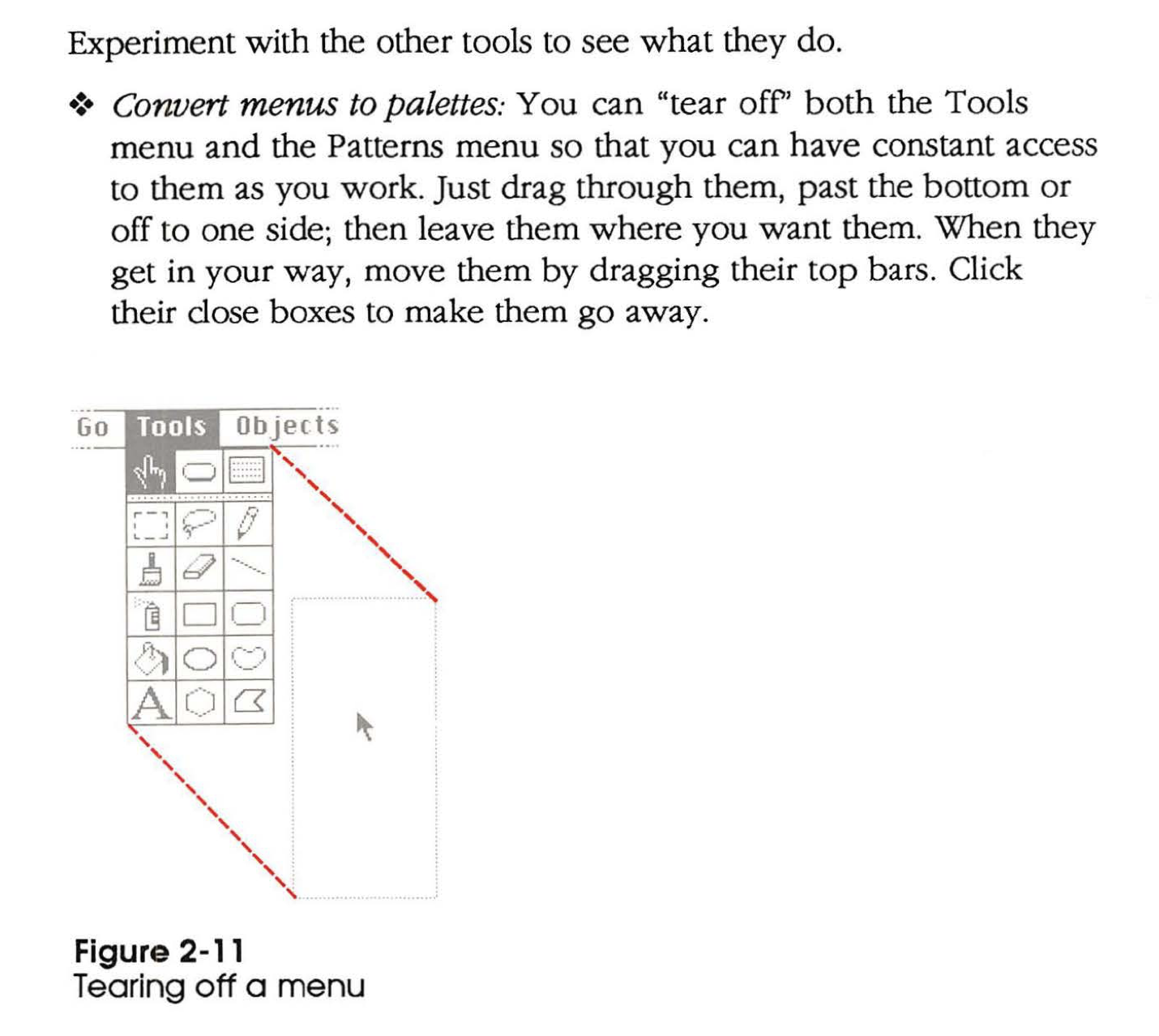
As a system-wide behavior, any program can pick up these benefits: whatever controls a program makes available in its menus can be “torn off” and brought into the user’s workspace persistently.
Users can then design their workspace with the controls they need most often, or for their current task.
Quantized semantic zoom
This system allows users to scale the level of detail shown on different nodes as needed to manipulate sounds and music. It does this via “local quantized zooming”, in which each component has a small set of sizes at which verying degress of information and controls are made available.
This lets the user underemphasize the nodes not needed for the current task, and overemphasize those which matter most. If the user discovers that a previously unimportant node might help in a quick experiment, one click will do the trick, bringing that node’s full set of controls and visualizations to the fore.
Having this kind of frictionless control over what’s in focus, what’s on the periphery, and what’s in the background lets users engage fluidly with their work.
Spatial personal computing canvas
In an experiment we explored in an earlier lab note, users could construct the views they needed by directly manipulating their items:
In this case, I’ve created a horizontal list of my inbox’s emails, with contents fully rendered, and a reply bar accessible on each (this is my preferred way of interacting with email).
The “fan out” gesture contained a surprising amount of information: I could have made a vertical or a horizontal list, and by dragging in a particular direction, I sorted the emails in descending order. The “unpinch” to scale the emails up allowed me to reach a size that includes their fully-rendered contents (rather than just the preview text), as well as a quick reply bar.
Similarly, in an experiment I created with colleagues early during work at Ink & Switch that would become Embark, we have a canvas that allows for the construction of needed interfaces by way of widgets which exist in a system that allows other widgets to react to donated data (audio on for narration):
Userland-defined primitives
Last year, I built a recreation of the Canon Cat’s document user environment, and lived in this environment for a couple weeks.
The Canon Cat had a streamlined computing experience: the operating environment consisted entirely of one stream of text. And it had no mouse — for navigation, it featured two physical “leap keys” below the spacebar which you could hold down as you type a sequence of characters to jump to the previous or next instance of that sequence.
As a result, keyboard shortcuts for navigation were not special cases to build or learn; you could leap to space, return, or the document separater character to move to the beginning or end of the word, paragraph, or document. Since these two-key shortcuts were a property of how the leap keys work, you could build your own first-class navigational features with the text you choose to type. An asterisk could be left by sentences needing review, for example, giving you a two-key shortcut to these parts of your document.
It’s as easy as typing, just as you’re doing the rest of the time in this environment. You could do this for something you need just for the current task at hand, as a pattern that you use for years to come, or anything in between.
Here’s a demo of this system:
Different users have different needs, and for those differences, people can generally look for different apps or certain settings. But each individual user has different needs at different times, too. These different needs might last a few moments or a few months, and could be equally supported by extemporaneous user interfaces.
Critically, “constructing” extemporaneous UIs only involves direct interaction with the things users need on screen, causing a change in emphasis on certain controls and information. It does not require mucking around in settings panels, writing code to specify the change, or laying things out in a WYSIWYG interface editor.
It’s rare to run into an extemporaneous interface in the wild. It almost feels like the stuff of wizardry: a user can wave their wand and the interface reorganizes itself according to their particular wants and needs; into an arrangement that has maybe never existed before, and may never exist again.
P.S. Do you have other examples of extemporaneous UIs? Please send them my way, as I’d love to add them here.
Something spark a thought? Email me, or come chat on Bluesky, on Mastodon, or on Twitter.