The trailing inspector
Design • Mail Pilot 5 • October 4, 2021
One of the notable additions to the Mail Pilot 5 interface is a collapsible panel on the trailing edge of the screen (the right side in right-to-left languages), available in both the Mac and iPad apps. It’s similar to the inspectors you’ll find in many of Apple’s apps like Pages, Photos, and Xcode.
This panel is home to a number of different things: deeper navigation, connection to potentially relevant information, and message actions. Some examples for each:
Deeper navigation: Filter to the reminders for a specific date in one click, or to the messages from a specific contact among a long list.
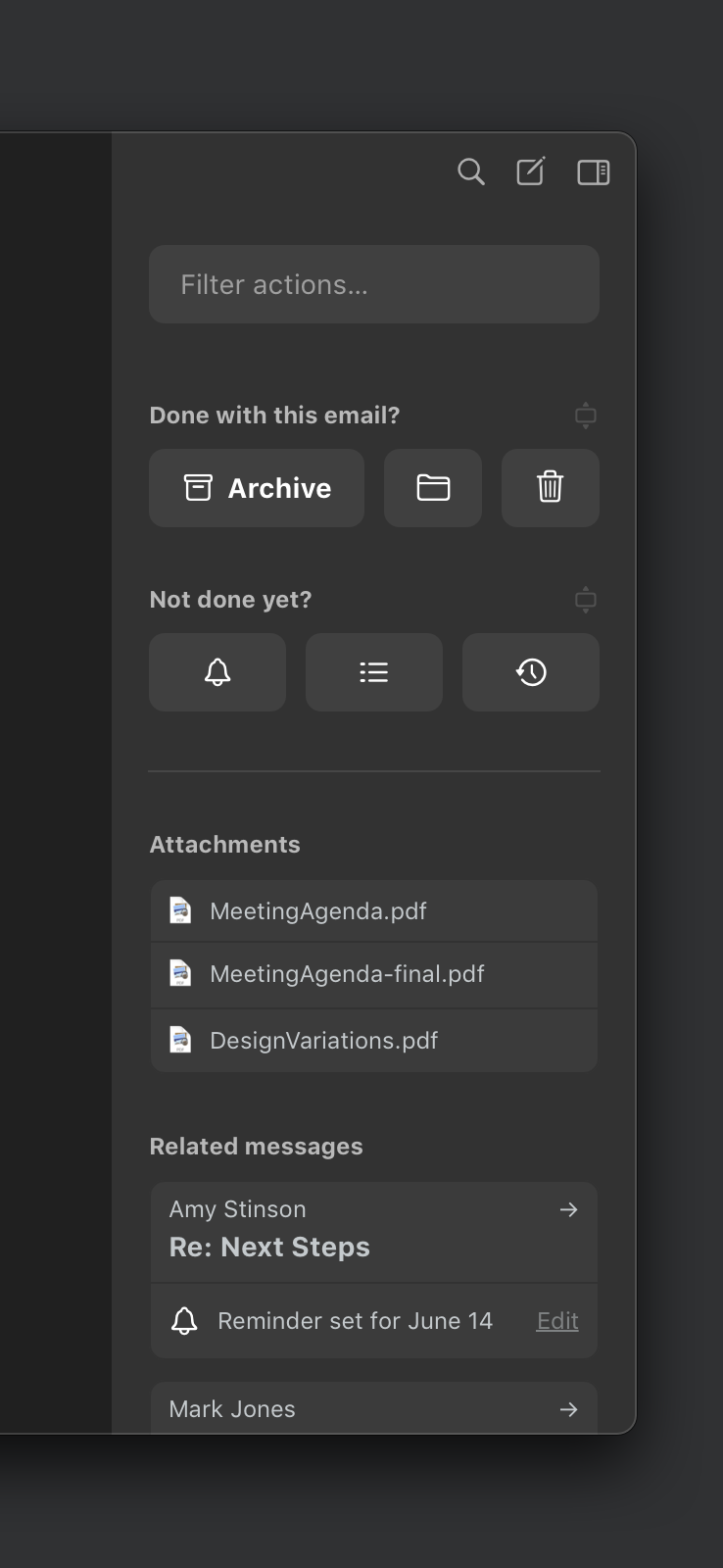
Relevant information: Other messages from the opened message’s sender, particularly those that are incomplete (newly received, reminders, etc.), or direct access to attachments otherwise buried in the thread.
Message actions: All the actions you might take on a message: completing, setting reminders, sending to other apps, etc.
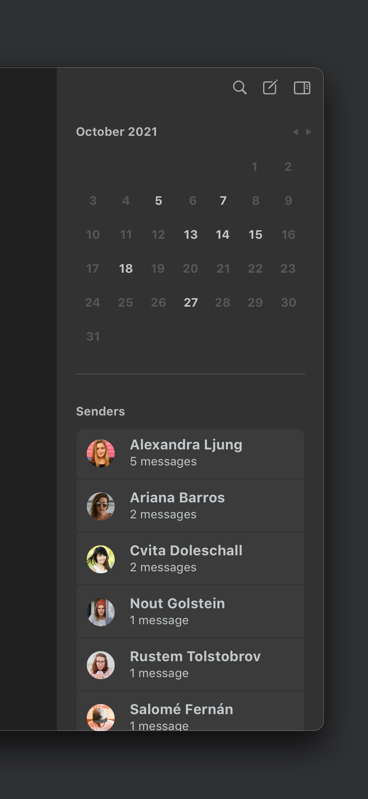
First: When viewing your list of upcoming reminders, the inspector will let you quickly filter down to one date or sender.
Second: When a message is selected, the inspector will give you actions, attachments in the thread, and related messages.
Actions live over here for a few reasons, but the most notable reason is ergonomics.
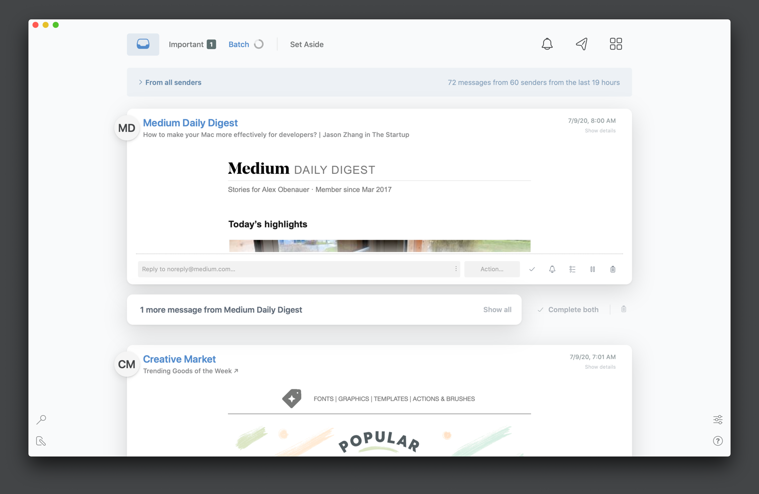
In Mail Pilot 4, actions are in a horizontal menu within each message card. They’re also available in a vertical menu that pops up when you click or type to filter among the menu.

On an iPad, this would be a tedious proposition: the actions are in the middle of the screen, and they move with the messages. You would have to let go of your device with one hand to track into the screen for common actions, and since the actions are horizontally displayed, your hand and arm would cover much of the menu when trying to choose, track, and tap on an option.
In Mail Pilot 5, with actions in a list on the side of the screen, they can be more easily used by the hand holding the device (without having to let go of it), and you won’t cover up the menu by trying to use it.
Further, by keeping these commonly used buttons in one place, when using a mouse or trackpad on Mac or iPad, or touch on iPad, users can rely on muscle memory as they get comfortable with the app.
This right-side panel also gives more room to create clarity. I’ll cover this in greater detail in the next design article.
Mail Pilot 4’s layout was the direct result of an exercise I undertook trying to design an email client with only one column. Mail Pilot had used up to four columns in some designs to support Mail Pilot 4’s new featureset (separating important from batched emails, and separating messages by sender).
In part to prepare it for the iPad (which at the time had much smaller screen sizes than the iPad Pro lineup features today), I designed all of the same functionality within one column. This worked by using message cards instead of the standard message list and message details columns, and a top navigation bar instead of the standard source list.
But over time, as new functionality was implemented in the existing design, it was clear the one column layout was too rigid. The interface left no room for the diverse array of features expected by different email users, and it left no room for making its more advanced functionality discoverable, learnable, and usable. The latter problem has grown more evident as more first-time users have tried out Mail Pilot.
At the same time, over the last several years, macOS and iPadOS have centered in on some great interface standards that users look for in all of their apps, including Mail Pilot. For example, the source list made its debut on iPadOS across many of the default apps a few years ago, along with some larger iPad screens.
Mail Pilot 5 uses these standard components, and the expectations that go along with them, to present a familiar interface to long-time macOS and iPadOS users, while giving new real estate to the features that Mail Pilot brings to email.
At the same time, many Mail Pilot users have become accustomed to using keyboard shortcuts and prefer a simpler interface, so new panels like the inspector are collapsible, allowing us to have the svelte, one-column interface whenever it’s wanted.