Ten pages
September, 2011. A few weeks into my senior year as an undergrad in computer science, some startling news was sprung onto me — a “journal check” was coming in two days.
This was startling for one reason: I was a terrible student. I didn’t buy a course’s textbook until it was clear I’d really need it (this was usually a frantic purchase just before the exam).
But one course, Design of Information, was different. It was taught by Dr. Harrison, a California architect who had spent much of his career in resarch at Xerox PARC. He was exactly how you imagined college professors would be when you were a kid: highly critical and discerning, but ready to celebrate truly great work when he sees it.
This was a class I was excited for — although I couldn’t have imagined that it would spark the start of my career. I bought the book for the course outright. But the design journal? I guess that was a step too far. So when I found out about the “journal check” I naturally panicked.
Besides buying a notebook, I had to fill ten of its pages quickly. Sitting at the hand-me-down table in my college apartment a few miles from campus, I began to journal.
In order to get the minimum requirement quickly met, I wanted to journal on a topic so complex and so answerless that it would easily fill ten pages in one go. The answer came to me pretty easily: email.
Email, right? Everyone seemed to hate it. Somehow it was necessary and pervasive. And yet for some reason it was a drag on everyone’s work. Everyone hated it. What’s the rub? Why do we have this friction? Why does it work so terribly for us? Why hasn’t anyone addressed this? Or have they tried, and there is just no easy solution?
Exploring these questions seemed like a very easy way to fill ten pages and be done with the assignment.
I ended up only filling five or six pages when I knew I had to stop — what I was looking at in my journal was way too interesting to hand in as an assignment. What I was looking at was something I had to pursue in earnest. When I nervously showed my professor during his office hours, to my surprise, he agreed wholeheartedly, and helped me figure out my next steps.
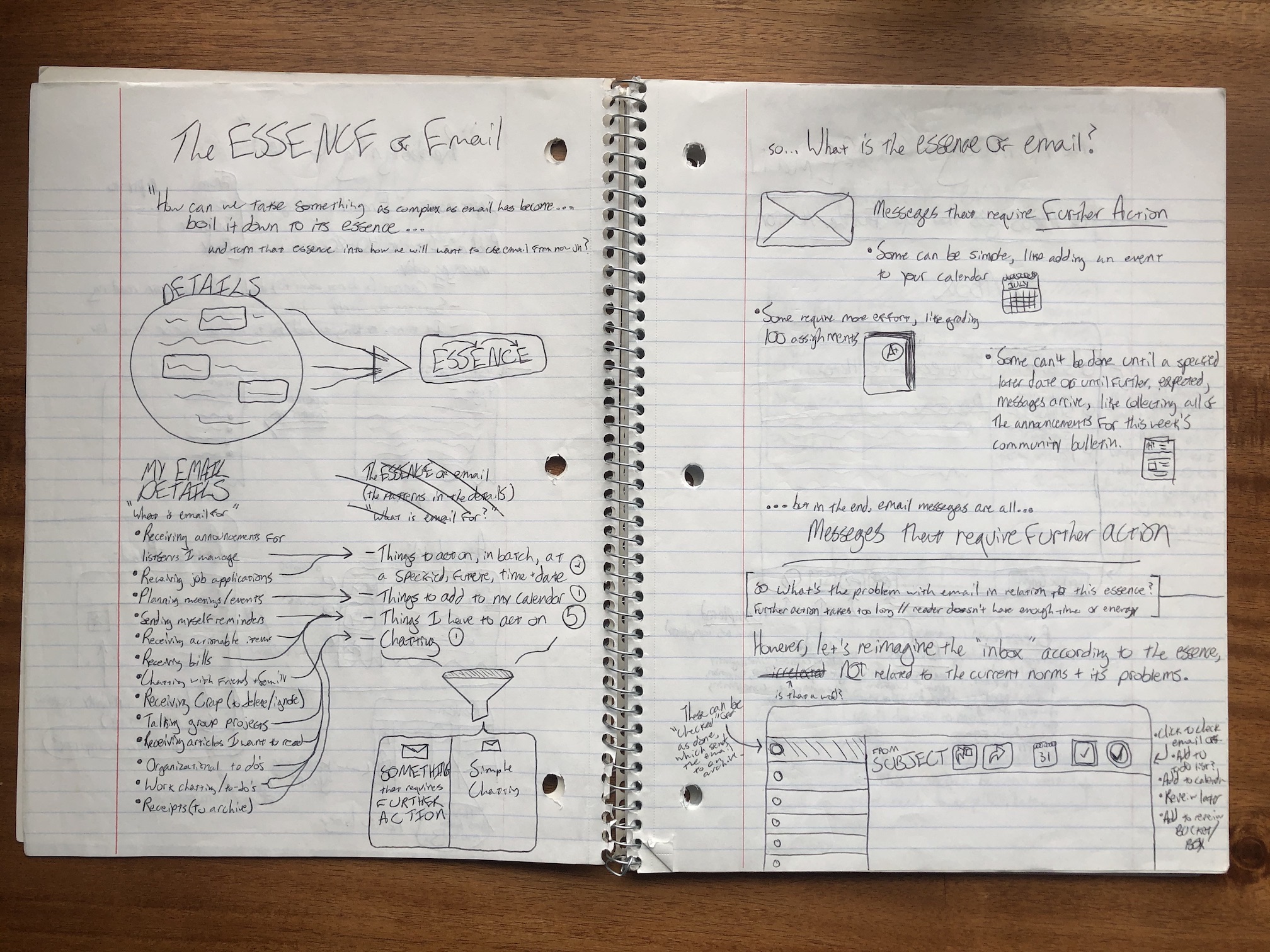
The essence of email
The most “innovation” that the user experience of email had seen in the prior decade was tags in Gmail.
It was clear that there was something fundamentally wrong with email; as though the use cases it was designed for did not align with the use cases we actually used it for by 2011.
In order to figure out what that difference was, I wanted to get down to the essence of email, as we actually used it; not how it works, but how we treat it.
That’s where my journaling began:
Going through hundreds of my most recent emails and categorizing them, I hit on the first insight that would power the first few years of my products’ success:
All email messages require some sort of further action.
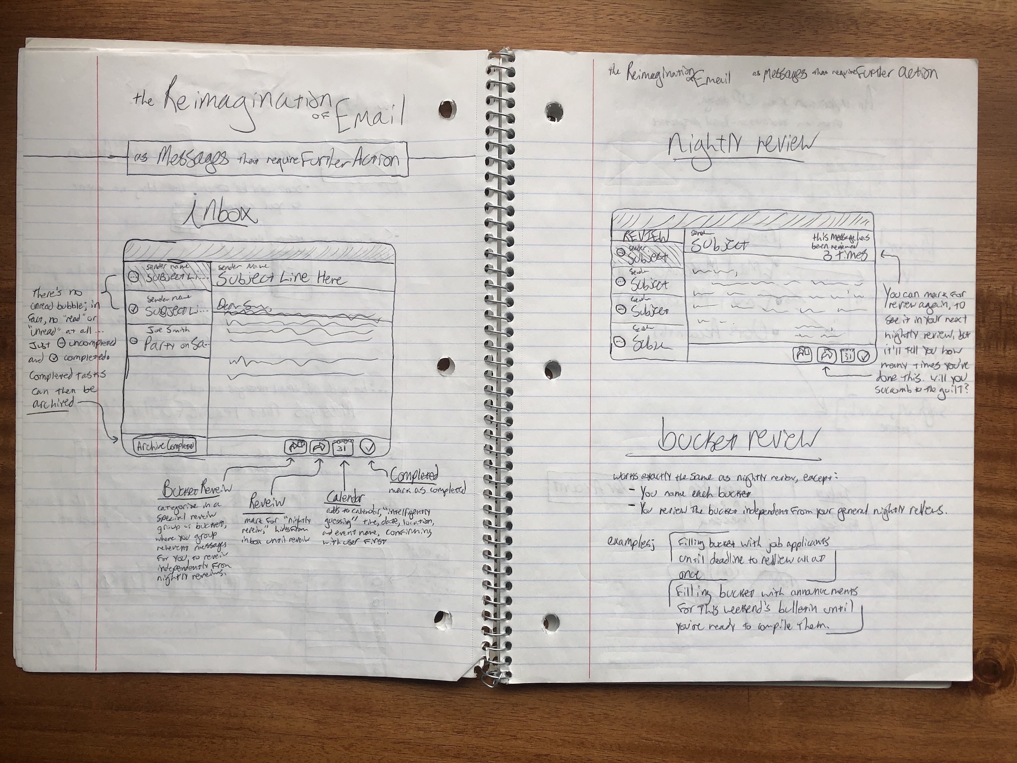
Reimagining email as messages that require further action
Whether it’s writing a reply, scheduling a meeting, reviewing some work, sending over a document, or just deleting the email message, there is some action you have to take with each email message.
What immediately seems odd, when you consider this reality, is that the email client is designed more like a news reader with unread vs. read, rather than being designed more like a to-do list with incomplete vs. complete.
Within this framing, it became clear that a more effective inbox would have controls like that of a to-do list. Messages would enter your inbox as incomplete, and stay that way even after you’ve read them. Once you were done with the actions associated with an email you could mark it as complete, archiving it with your other completed messages.
At the time, users of traditional email clients would constantly mark things as unread in order to remember to act on them (a bandaid on a deeper, more fundamental problem). Messages would often slip through the cracks when they were accidentally marked as read again.
Another feature that seemed like a clear win to come over from to-do list software: Reminders. You should be able to set a reminder on an email, causing it to leave your inbox (reducing clutter), then pop back up to the top of your inbox at the specified time. This would give you a first-class way to deal with bills, meeting agendas, deliveries, and all sorts of other messages that you need or want to defer acting on. At the time, no such feature existed in email.
As my notes went on, other features came out of this initial insight, which I’ll dive into in a another chapter.
Growing the idea
The ideas that sprung from this simple insight were fascinating. Of course they needed experimentation and tweaking, but it was clear that this was something potentially exceptional. My mind could not let go of these ideas because I wanted to use them myself; I badly wanted my inbox to work this way.
Unable to stop thinking about them, over the course of the next few months, I worked hard at getting these ideas to catch on — while also building the very first prototype, and considering if the then-newfangled crowdfunding platform Kickstarter could be a worthwhile path to funding the project.

